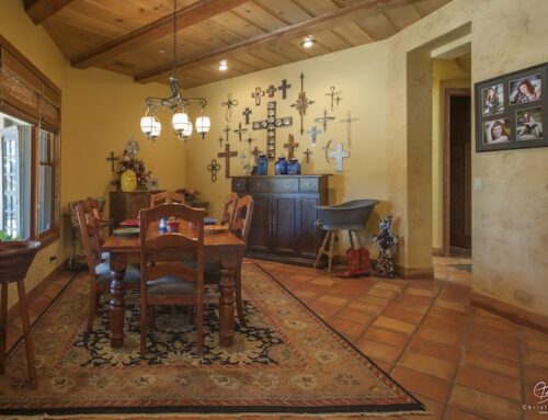
There are five elements of design you should use when designing your space. A great designer will help you execute these in your design project.
The elements are:
- Emphasis
- Balance
- Proportion
- Rhythm
- Color
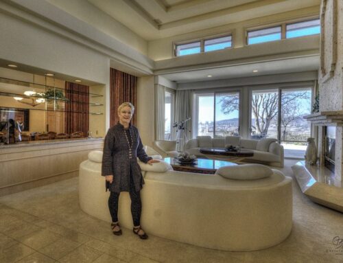
Balance is an important element of design. There are three types of balance: symmetrical, asymmetrical, and radial. Symmetrical balance is very formal and tends to look identical on each side. Though it can work in traditional architecture, it can be somewhat limited and unimaginative when so used. Asymmetrical balance is more casual, informal, and active. In this type of balance things are not divided equally along an obvious line. but instead will have items carefully placed at certain distances from a balance point. Asymmetrical balance allows for more freedom and creativity in its design application. Radial balance is circular and comes out from a center point. It’s not often used but when it is it is typically done in a dining room or family room. Radial design is very effective in conversation areas.
When hanging pictures it is important to take balance into consideration.The number one falsehood about hanging pictures and mirrors is that you hang them at eye level. In reality, you want to hang pictures and mirrors in accordance to the furniture setting that you have created. If you have a chest in your entry you should hang a mirror a few inches off the top of the chest and you should be able to see the top of your head in the mirror. If you have a tall wall you do not want to try to fill the wall vertically, but rather low enough to see and enjoy the pictures you put up. If you have a long wall and a small picture you want it on the far right or far left of the wall(but not in the center). For example, in a hallway you want a picture where you enter the hall so it’s the first thing you see upon entering it. If it is in the center you may not take the time to enjoy family photos or art as you are traveling by them.
STAY TUNED FOR MY WEEKLY ELEMENTS OF DESIGN TIPS.
